Appearance
Stack Studio
A drag and drop interface for creating Plugin Menus
Stack studio is a GUI for creating plugin user interfaces that appear before users in Nanome. A Nanome plugin usually contains two major components: plugin scripts and plugin UI. While the scripts contain the behavior and computation of the plugin, the plugin UI is what the users sees and accesses in Nanome software. To create a sophisticated Nanome plugin, it's very likely that you would need to both write the script and create the UI.
Get Started
Currently, Stack Studio is still in beta and we would love to hear your feedback! You can either send us an email (bugs@nanome.ai) or join our Slack user group to chat (https://nanome.ai/slack).
Download the latest StackStudio version 0.5.2:
If you are a Nanome Stack beta user, please download Stack Studio from the provided link and extract the compressed file. If you can't extract it, you can download any archiver such as 7zip to do so.
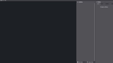
Once you extract the file, open StackStudio.exe from the extracted content. Once StackStudio.exe is running, you should be seeing the interface below.
Create a JSON file at your preferred location. Copy paste the RMSD plugin menu content from here into the JSON file.
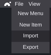
Open file option in Stack Studio and select [Import]. Choose the JSON file that you just created.
- Once the JSON file is loaded, you should be seeing the interface below.
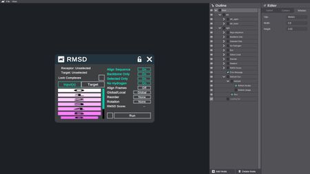
- This is the menu of Nanome's first-party plugin, RMSD. You can feel free to play with it to get a rough idea of how Stack Studio works.
Workspace
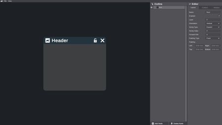
Menu View
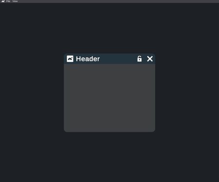
Menu view renders a 2D interactable preview of the menu that you are creating. Any changes that you make to the menu is immediately reflected here. For interactable menu contents such as buttons and sliders, you can use your mouse to interact with them in the preview to check their visual behavior such as highlight color. However, since this is only a preview, interacting with the menu will not trigger any function.
Outline View

Nanome plugin UI is managed in a hierarchical fashion, and layout provides an easy access to this hierarchy. Each component in the menu is called a node. A node's size is always smaller than its parent node. You can collapse or expand a node that contains multiple children nodes. Click on the eye icon on a node to toggle its visibility. Drag and drop a node to move it in the hierarchy and change it's parent.
Editor View
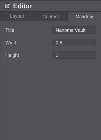
Editor provides options in editing the layout of a node, the node's content, and the menu size. These options are organized into three tabs. Switch tab by clicking on the tab that you want to view or edit. Switch what node you are editing by clicking on that node in the outline view.
Layout Tab

Here in layout tab, you can change the way children nodes are laid out under the node that you are editing.
Content Tab

Here in content tab, you can change the properties of a node's content. The properties that get displayed here depend on the type of the content. By default, a new node does not have any content. Click on [Add Content] to assign a content to this node.

When a node is assigned a content type, you can view and edit its properties, such as name and padding. The picture above shows the properties of a button. To learn more about what properties are available, check out the UI Components section.
Window Tab

Here in window tab, you can change the menu window title and size. This tab changes the menu window properties, so it is independent from the node you selected to edit.
UI Components
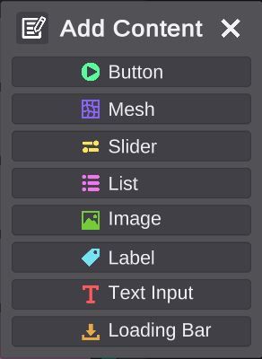
When you add content to a new node, these are the contents currently available.
Button
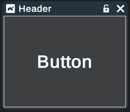
Button is the fundamental interactable component of a plugin menu. When clicked on, a button sends an event to the plugin script with its name as payload. A button can include five sub-components, all of which being optional: Text, Icon, Mesh, Outline, Tooltip. A button contains five states: Idle, Selected, Highlighted, Both, Unusable. You can customize the properties, such as color and visibility, of all five sub-components under all five states.
Mesh
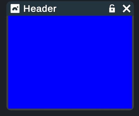
Mesh is a solid chunk that serves as a background. You can customize its color.
Slider
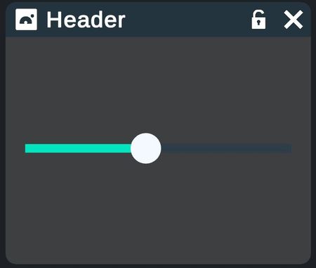
Slider is an interactable component that sends the current slider position to the plugin script. It is useful in allowing the plugin user to change a value.
List
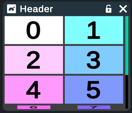
List is a two-dimensional grid of children nodes that have to be assigned and managed during runtime in the plugin script. It allows the plugin to dynamically generate a menu of contents.
Image
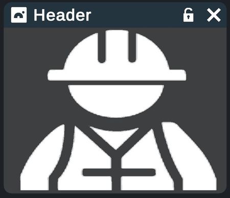
Image is a 2D image. You can change the image's color.
Label
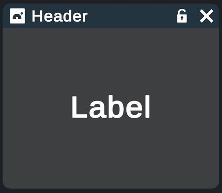
Label is a static text that cannot be interacted.
Text Input
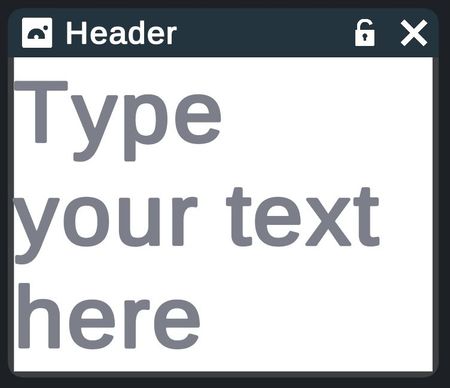
Text input is a text input field. The field's content is sent to the plugin script when the text is submitted.
Loading Bar
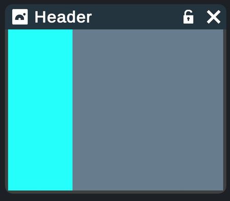
Loading bar is a horizontal bar that can be empty or filled by a solid color that represents progress. It is mainly used to indicate progress for plugins that can take a longer time to run.
Integrate a Plugin Menu
Integrating a menu created with Stack Studio into a plugin is simple:
1. Export the plugin menu as a JSON file
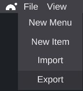
Open the file dropdown menu and select [Export].
2. Place the exported JSON file in the folder where you are creating your plugin
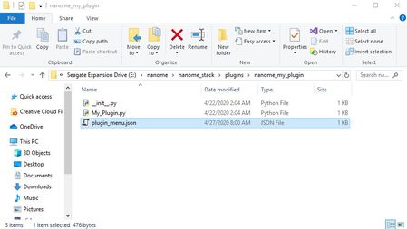
Be sure to check that this is the same folder as the plugin script that you are writing.
Hotkeys
ctrl-n – spawn a new menu
n – add a layoutnode
c – add a content
1,2,3 – change tabs on the inspector
up, down – change selected node to the one above, below
left, right – change selected node to parent, child.
ctrl-up, ctrl-down – move selected node up/down
ctrl-left, ctrl-right – deparent, parent selected node
ctrl-c, ctrl-x, ctrl-v – copy, cut , paste selected node
ctrl-shift-c, ctrl-shift-v – copy node to clipboard, paste node from clipboard
ctrl-s, ctrl-o – export import
F2 – rename selected node
delete, backspace – delete selected node