

New Updates
New LiveDesign Plugin Documentation
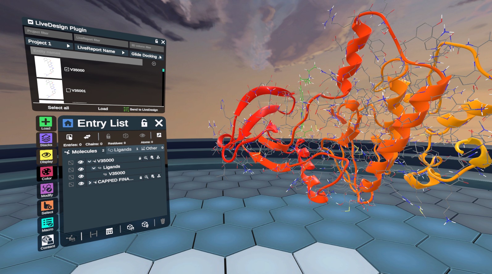
Explore our new LiveDesign plugin that allows you to seamlessly load molecular data from LiveDesign and send ligand poses to LiveReports. Authenticate with tokens, filter entities, and visualize 3D data directly in Nanome.
Learn MoreVideos of Spatial Recordings
Advanced Tutorials
Nanome Youtube Channel


Nanome Blog
Featured Sections
Main Menus
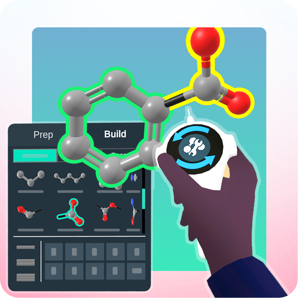
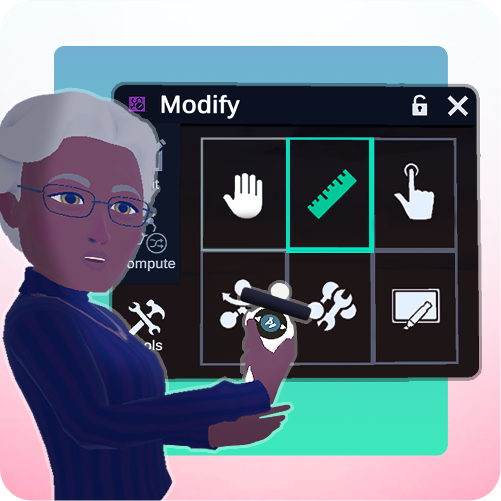
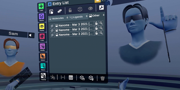
All the menus of NanomeTools Menu
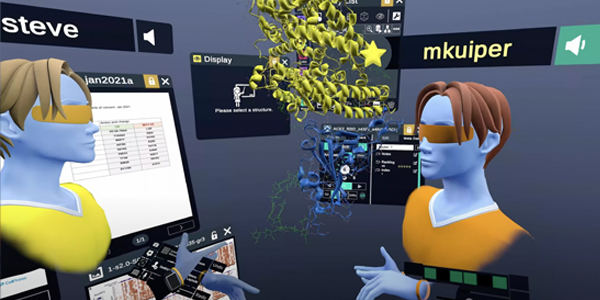
All the tools of NanomeNanome Stacks
An overview of the plugin systemCompatible Headsets
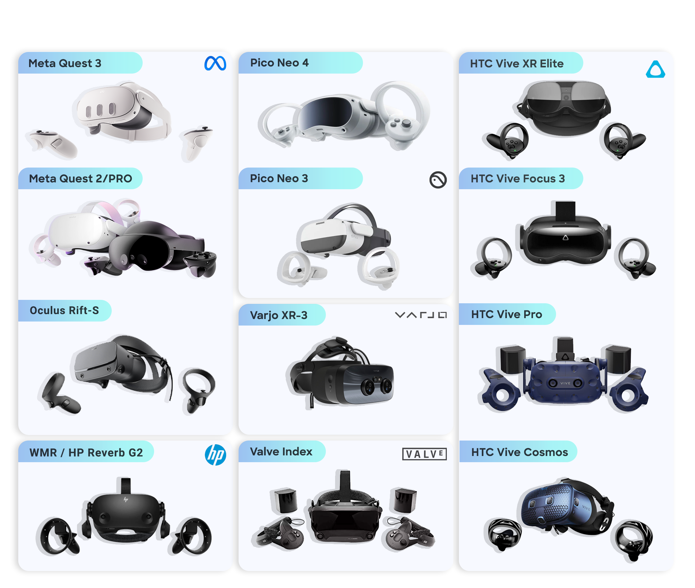
Requirements
Overview →